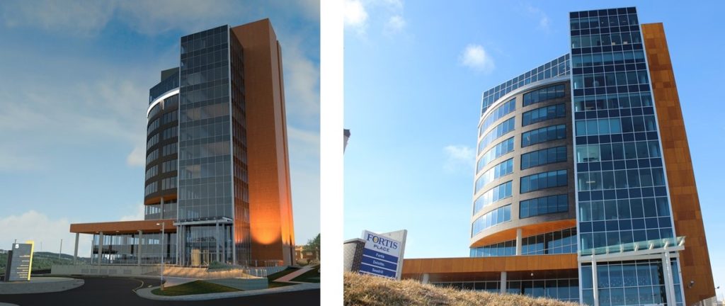
St. John’s is awash in proposals at this time. In fact, this week, as I write, we will see a very public defence of some of the most contentious downtown building proposals that have surfaced since we were plunged into bleak economic times about five years ago when oil prices came crashing down around us.
On the slate for the near future are the Anglican Cathedral Annex, the Parish Lane condominiums, an infill development at 331 Water Street, a six-storey commercial / apartment complex for 43-53 Rowan Street in Churchill Square and an addition to the JAG Hotel with more bells and whistles than any big top. Let’s not be facetious. These are major. So major, in fact, that lost in the mix is a tarting up of the Quality Hotel on Hill O Chips with a less-than-quality mixed bag of exterior finishes. (Ref: “simulated wood siding”.)
Most of these proposals don’t revolve around architectural criticism. They are more about the urban context, and, we have a mirror that we can hold up as a basis for evaluation, that mirror being the Municipal Plan. Certain key goals, especially about preserving neighbourhood and promoting green space, are critical to the discussion, and subsequently to the evaluation.
So it is in the context of this lively setting I would like to talk about architectural transparency and integrity.
I’m not much of an architectural critic. I simply don’t have the creds. But I spent most of my life in architectural sales and I know what goes into a credible and honest presentation – a presentation that makes it crystal clear (to both the client and the public) just what you intend to erect on a given site. The corollary of this, then, is to deliver on what you promised, whether in illustration or in word.
In my working life this was a mantra. So if I illustrated a concept that went to the client and/or general public, I bloody-well knew in advance that this was achievable in terms of budget and practicality. The fight to get to opening a building without wandering off the path of intent is, to be frank, brutal. It is not for the faint of heart. This was true of the Fortis Project. The first picture above is a concept illustration of the proposal. The second is a photo of what was ultimately erected. Fortis cannot be faulted for not delivering on what they promised.
To further demonstrate, see below my design illustration for the Credit Union Building on Topsail Road and the end product.

Also, here is an early rendering of the Orthodontic Clinic on Hebron Way and a photograph of the actual building.

So what’s the point here?
Let’s be frank. If the concept presentation is sufficiently vague, there is much room for major design changes and addressing budgets that were never realistic. It leads one to believe that the developer isn’t really committed to the product and is not prepared to spend the money to have the concept properly explored or illustrated, or the architect really hasn’t thought it through.
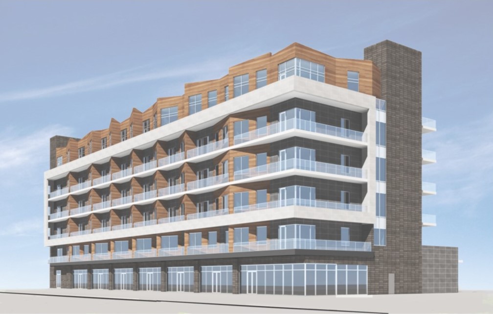
I get a sense of this from the recent submission to City Council for the six-storey proposal for the former Dominion site in Churchill Square. This was first presented to Council in July of 2018, but was updated in April of this year. The illustrations provided with this submission show a building floating in space, devoid of scale and context. In short, it is impossible to cognitively interpret what impact the proposed development will have on the square. Let’s put aside the cookie-cutter, mechanical design (one structural bay, repeat as necessary until site is full) and focus on how poorly this “design” has been communicated. It is one of the most splendid mixed used neighborhoods in the city. Neither the concept nor the illustration does the neighbourhood (or the public at large) justice.
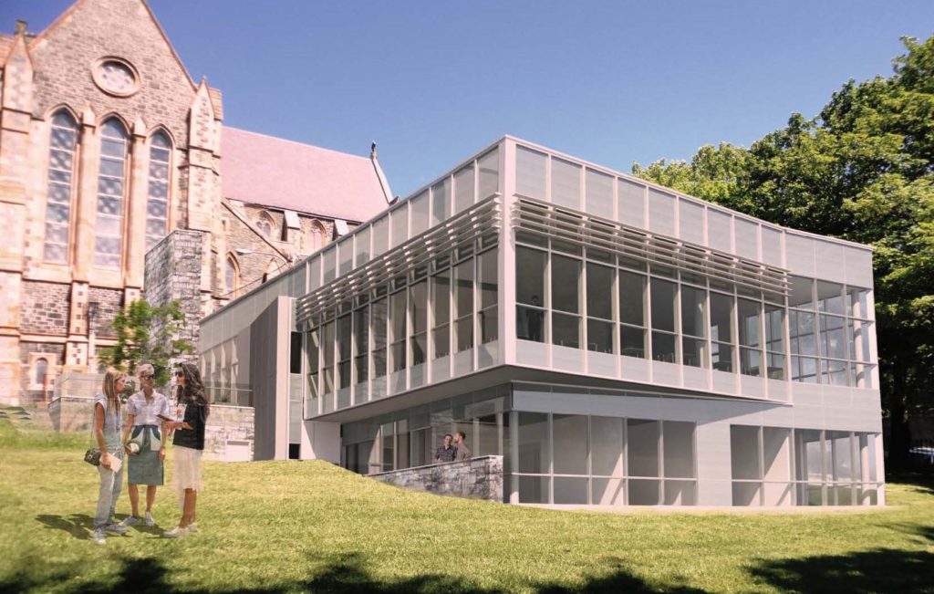
In total contrast I would offer the illustrations provided by local architect Greg Snow for the Anglican Cathedral Annex. You may dislike the modern design interpretation, or you may be relieved that the designers did not try to compete with the architectural brilliance of the Cathedral of St. John the Baptist. Either way, the architect has succeeded in clearly communicating the scale and context of the proposal, allowing you to form an opinion based on a plethora of quality graphics.
The public’s responsibility is to lock down the design (if it is approved) and ensure the proponent delivers on what they have communicated.
Let’s hope such delivery is not the case with the 331 Water Street development proposal. If you can’t picture the site, think parking lot next to the Murray Premises. Besides brick, this building promises stucco (a proven loser in the local environment), metal siding roof screen (invoking the stunning mansard roof on the Water Street elevation of the former Templeton’s) and silicon butt joint window mullions (with a proven track record in Texas). Please. Let’s not put up a building in the downtown with finishes that are so sad and problematic that a complete makeover will be required in ten years.
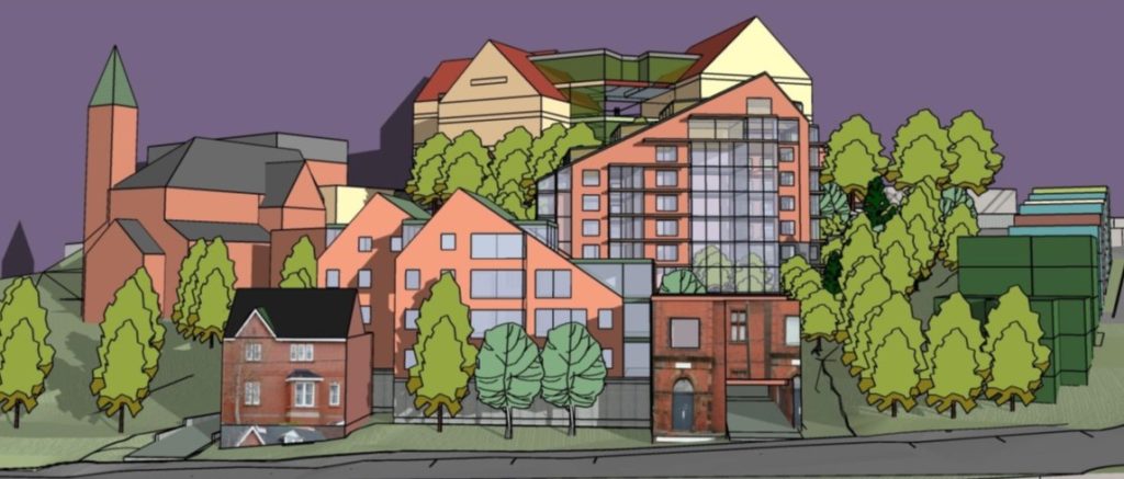
The Parish Lane condominium proposal of January 2019, on first blush, seems to convey an overwhelming amount of information. But a detailed review would suggest much of the information presented is superficial wishful thinking. The illustrations are many and varied, and do convey scale and context. But at the same time, the caricatures (these are hardly the proverbial “artist renderings”) do little to communicate to anyone what the building materials will really look like. When a window is depicted as a single-line rectangle, one has to be suspect as to how the fenestration will really appear (extent of framing, glass colour, etc.) You cannot truly hope to gain any idea of this development’s real impact on the urban fabric. And to assess whether or not the existing urban greenspace will be obliterated or not – well, good luck with that.
In stark contrast to Parish Lane is the July 2019 Land Use Assessment Report for the JAG Hotel extension. Like the Anglican Cathedral Annex, there is no shortage of detailed graphic communication. In fact, the images are almost chilling in their realistic depiction! The submission cannot in any way be criticized for lack of information. The horse is choking on it.
The architectural program is ambitious, and if the owner can actually carry it off – especially the 1155 person capacity theatre venue – more power to him/her. I believe the City needs such a venue and it will be excellent for the arts. I’m not sure about the proponent’s parking plan however – and the contention that there are 1482 parking spaces available within seven minutes’ walk. Are we to assume that no events are occurring at the Convention Centre or Mile One for this to be so?
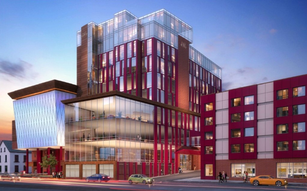
In terms of the materials and forms depicted in the renderings, the integrity test will be to see if these are actually delivered and appear as illustrated. Or will we see a scaling down or substitutions made as part of a fiscal exercise? Restraint is hardly the central theme of this proposal.
Additionally, I find some of the stated design rationale to range from a bit of a stretch to downright silly. The “modern translation of main body row house form” … “modern translation of mansard roof” … “symbolized notion of music notes“. Please. What nonsense is that?
Except for the latter, if you were looking for any great architectural criticism in this post, I have probably disappointed you. I am no Cristopher Hume. The point I am making is simply this: architects have great public responsibility. If they fail to graphically communicate what they intend to do, then you as the public deserve better. Speak up. Stop the project in its tracks.
On the other hand, if a development is approved on the basis of what has been illustrated or essentially promised, then we (as the public) also have a responsibility to see that that is exactly what is delivered. If not, remove it. Start again. Insist on it.

Very interesting and informative.
The Churchill Square pic in particular is basically useless in terms of how the square will be changed. Surrounding businesses and homes behind the structure have little way of knowing what the new building will bring.